Getting Started With Web Components and polymer.js
This article describes still rarely supported Shadow DOM features. If you want to see them in action, make sure you use Chrome Canary with turned on “Experimental web platform features” found at about:flags.
I spent a lot of time on codepen the last days to train my CSS skills and to relax a bit (it is really awesome to just play around there while watching a movie). One thing I created was a styled checkbox. And while doing that, the idea came to me, that this checkbox is a perfect use case to start playing around with this magic thing called “web components”, that is heavily around since a few month and is probably the “next big thing” in web development.
Web components are basically small encapsuled units inside of a website or web application(like for example the HTML5 video element). They include their own styling (CSS) and their own behaviour (JS). And this is the biggest advantage of them. Imagine little pieces inside of your web app, that are not influenced by the global stylesheet and whose children are not affected by any written JavaScript function. This way you end up with a box of bricks and the only thing to do is putting them together easily. Additionally you can use them whereever you want, because they include everything they need to look awesome and to behave awesome. Sounds really like a dream to me. :)
If you are interested in that topic, recommended ressources are the following:
- slides about web components created by Google
- talk about web components at CSSconf.eu
- W3C working draft about web components
I started looking around and decided to use polymer.js (written by the Google guys) to play around with the principle of web components. Unfortunately they are rarely supported these days and this library gives me the opportunity to use this technique already today by providing needed polyfills.
So, here is my checkbox! Let’s make a “real” new fancy web component out of it.
I started by downloading the basic stuff from HTML5BOILERPLATE and the polymer component library. The first things to start using it are implementing the polymer script inside of the head of the document and loading your first web component file. Web components need to include a hyphen inside of their name defined by the specs to avoid conflicts with existing elements.
1 2 3 4 5 | |
Next step is to create this component html file, that will define the new web component. I created a new folder for my web components and created the file sj-checkbox.html. Inside of that file I started to implement the new component regarding the polymer documentation.
1 2 3 4 5 6 7 8 | |
That is all you need. Wrap everything in the polymer-element tag, set a name as attribute, use the new HTML5 template element to define your markup, call the Polymer constructor inside of a script tag and you are done. After that, you can use a new custom element inside of your “ìndex.html“`.
1 2 3 4 5 | |
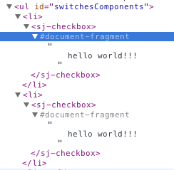
When you inspect this in a current version of Chrome Canary and you enabled the needed flags (look here) you will see the power of this technique.

Our little ‘hello world’ message is visible on our screen and it is encapsulated inside of the shadow DOM. I mean, how awesome is that?
After this success I started implementing the actual new checkbox markup and the needed styles.
1 2 3 4 5 6 7 8 9 10 11 12 13 14 15 16 17 18 | |
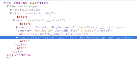
That worked actually on first try and I saw the new checkbox and its “hidden” markup inside of the shadow DOM tree. I prepared the checkbox to be configurable easily so that it is possible to get it in three different sizes by just adding the class “small”, “medium” or “big” to the switchcontainer. To achieve that, you can easily add custom attributes to your new created web component.
1 2 3 4 5 | |
Additionally you have to define inside of your component html file (remember components/sj-checkbox.html) that this value is readable. This is done by setting a new attribute attributes to the polymer-element element defining the given values. It is also possible to set default value for the size attribute then. You can then access the value by calling the attribute name wrapped into two curly braces inside of your component html.
1 2 3 4 5 6 7 8 9 10 11 12 13 14 15 16 17 18 19 20 21 22 23 | |
So far so good. The checkbox appears with its full markup and depending styles.

After that the checkboxes are implemented in different sizes and it is time to add some functionality to them. Usually the way is to bind an event listener to the change event of the input element and then update whatever needs to be updated. Unfortunately this elements do not trigger any change events anymore, because they are hidden inside of the shadow DOM. Polymer provides an easy way to implement custom events to solve this problem.
You only have to implement a on-change attribute on the input field hidden inside of the shadow DOM and define a callback function, that should be executed when the event is triggered. Inside of this function you are able to trigger a custom event using this.fire().
1 2 3 4 5 6 7 8 9 10 11 12 13 14 15 16 17 18 19 20 21 22 23 24 25 26 27 28 | |
Afterwards you can easily listen to this event and react to it.
1 2 3 4 5 6 7 8 9 10 11 12 13 14 15 16 17 18 19 | |
About that is to say, that when you fire events this way inside of your component you can pass as second argument an object which will be accessable inside of the event handler under the detail key. In my case I am just handing over the id of the input element.
Stuff to be careful with
The two following issues with polymer are already reported bug tickets. Before continue reading you can check out the state of both here:
When checking browser compability of this I noticed that using id’s inside of your web components can be really tricky. There is no problem in case the browser supports web components (id’s are inside of the shadow DOM and totally encapsulated), but if not polymer does some magic and your component will appear in the form of normal html. Then you’ve got the same id multiple times in your application, which leads to invalid markup and maybe unexpected behaviour. My solution for that was adding kind of fallbackId to the component.
1 2 | |
1 2 3 4 5 6 7 8 | |
Another thing I noticed is, that you should always namespace your events triggered by your components. In my first implementation (which you see a few lines above) I defined the component to trigger a change event. That worked fine in Canary, but unfortunately in other browsers there are two events fired. One by the web component itself and on by the input field that is not hidden inside of the shadow DOM. I ended up with triggering an event called componentChange and that worked fine.
Jap and that is it. You can check out the result here – check it out in Canaray, it’s just awesome.
I will continue playing around with this. My next goal is to achieve a new input element type like <input type="myFancyCheckbox"> that I actually can use inside of my forms, but I have got no idea how this works yet. Addiontally implementing custom pseudo elements to make the components accessible and styleable from the outside seams to be a reasonable next step.
So, thanks for reading. Feedback is as always really welcome. ;)
A follow up post about making the checkbox customizable can be found here.