Getting Started With Web Components and polymer.js - II
This article describes still rarely supported Shadow DOM features. If you want to see them in action, make sure you use Chrome Canary with turned on “Experimental web platform features” found at about:flags.
This is the second article of a tutorial series (I do not know yet how many articles will follow, but let us call it a series) about how to get started with web components and polymer.js. In case you missed the first article you can check it here. This article will describe things to improve the checkbox component, that got built up in the last article. By improving I mean making the web component more configurable and making it stylable from the “outside”. Additionally it will cover some mistakes that were made in first place, but let us just dive into it. ;)
First of all I got a lot of feedback on the first article and I really want to thank everyone who read it, commented it, retweeted it and “whatever” it. Thank you – that was really awesome!
Bugs discovered in last article
In the last article I discovered two bugs inside of polymer.js library:
- events are bubbling out of the “Shadow DOM” in polyfill
- using ID’s can lead to misbehaviour in polyfill
In my case the first bug was, that the change event bubbled out of the custom element provided by polymer (bug is already reported). After noticing this, I checked out the spec for Shadow DOM and had to discover something interesting. According to the spec there are only specific events defined, that are not allowed to bubble out of the element’s Shadow DOM.
“The following events must always be stopped at the nearest shadow boundary:
- abort
- error
- select
- change
- load
- reset
- resize
- scroll
- selectstart”
I do not know, what is the base for this event definition, but when dealing with input fields for example it is really good to know, that events like keypress are supposed to bubble up and for example the change event is not.
For me that means, when I will build up custom elements, I will stick to custom events to avoid misbehaviour in first plase. It feels a bit strange to me that I am “allowed” to attach listener to the keypress event and not to the change event (which I would personally prefer), but I guess I have to deal with it. ;)
The second bug is about ID handling inside of the polymer polyfill. There is no solution for ID handling yet. It is not a big deal, when you want to use your new custom element only once (or you only have to support Chrome canary ;)), but if you want to have multiple elements of the same custom element in one document, you will end up with duplicate ID’s and in specific cases (using label-for-relation) with misbehaviour. It doesn’t look like there will be a solution for that soon (bug ticket), but I described a workaround in the first article.
@host rule and defining styles for host element
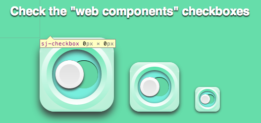
There was on thing I did not notice when developing the first web component version of my checkbox. It had no width and height.

The reason for that is, that when defining new custom elements they are defined to be display : inline per default. To solve this issue the custom element itself needs to be styled. The web components spec defines a @host rule for this purpose (read spec here).
The old checkbox markup up was the following:
1 2 3 4 5 6 7 8 9 10 11 12 | |
It implemented a container, that had the class switch. This container included all the checkbox markup which got styled and represented the actual checkbox. By using the @host rule I was able to get rid of this container (because the host element itself takes the function as a container). Inside of it, it is possible to set the custom element to display : block, which leads to a proper width and height.
According to the spec, you have to use a :scope selector to apply your styling to the shadow host. :scope is a bit redundant in this case, but I already saw some people complaining about that, so I guess, the spec will change later on. For now you have to use it.
After cleaning up and using @host rule I ended up with this:
1 2 3 4 5 6 7 8 9 10 11 12 13 14 15 16 17 18 19 20 21 22 23 24 25 26 27 28 29 30 31 32 33 34 35 36 37 38 39 40 41 | |
The template now includes one div less and the CSS rules that were applied to the old div container moved into @host :scope. I really liked that, because it is always nice to have less markup for the same result. ;)
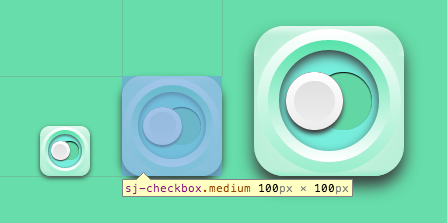
After that I decided to set no width and height for the custom element sj-checkbox at default, but provided three default sizes, which will be applied when setting a given class to the custom element. This way the custom element is configurable by just adding a class to it. That makes the web component easier to handle and it is relatively clear, what is going on, when looking at the markup for the dependent custom element.
1 2 3 | |
The reason why I set no default width and height is the following. If you want to define your desired styling to the custom element and it already has defined the rules for the element host you want to set, it will not work. Here are few examples what will work and what not:
Not working:
1 2 3 4 5 6 7 8 9 | |
Kind of working, but I try always to avoid usage of !important:
1 2 3 4 5 6 7 8 9 | |
Working:
1 2 3 4 5 6 7 8 9 | |
For me the third option is the best solution. The user is forced to define the width and height of the custom element by himself/herself or set a given class to use predefined rules. This way he/she has always to decide, what is wished and can implement it easily.
By defining @host styles (including rules for display, width and height) the custom element now has a proper width and height. :)

Making it configurable using pseudo attributes | part pseudo elements
I really like the way the checkbox is styled, but we are in the era of “Flat Design” now, right? So I decided to make it a bit more flexible and give the user of this component the possibility to remove the shadows, if he/she want to. This can be done by defining so called pseudo ID’s or part pseudo elements.
Using pseudo ID’s
By defining pseudo ID’s the creator of the web component gives the user the possibility to set styles to elements, that are hidden inside of the Shadow DOM. Everybody who styled a default input element probably noticed that already.
The tricky part about them is, that they have to be prefixed with x-. According to the spec custom pseudo-element values must be considered invalid, if they are not prefixed the correct way.
“The custom pseudo-element value must be considered valid if it starts with a U+0078 LATIN SMALL LETTER X, followed by U+002D HYPHEN-MINUS. Otherwise, the custom pseudo-element value must be considered invalid.”
After implementation of the pseudo ID’s the template for checkbox looks like this:
1 2 3 4 5 6 7 8 9 10 11 | |
Now it is possible to remove all the shadows, because the dependent elements are stylable from the “outside” with the following rules:
1 2 3 4 5 6 7 8 9 10 11 12 13 14 15 16 17 18 19 | |
About that is to say, that I really try the component to behave and look the same in shadow DOM supporting and not supporting browsers. That is why I implemented two rules. The first rule shows how to access elements with given pseudo ID’s. The second one is for the polyfill. We can just access the dependent element via the attribute CSS selector, because there is no “real” shadow DOM, where it could be hidden in. The polyfill just renders HTML inside of a custom element, which makes it really easy to select needed elements.
Using part pseudo elements
When implementing this ID solution, I did basically the same for all the elements. Reseting the styles for three different ID’s. I thought about that and it is the perfect use case for a class or something like that to achieve the goal. Remember the coding principle DRY (Do not repeat yourself)? ;)
The spec defines something called part pseudo-elements for that situation.
All you have to do for that is to give all elements a part-attribute.
1 2 3 4 5 6 7 8 9 10 11 | |
After implementing the new attributes, you can use the part pseudo element selector to style the matching elements.
1 2 3 4 5 6 7 8 9 10 11 12 13 14 15 16 17 18 19 20 21 22 | |
That looks much better. After using part pseudo attributes there is only one rule needed to give three elements the wished styling.
I implemented again two rules, to make it work for supporting and not supporting browsers. We have to be friendly to everyone, right? ;)
By using the part pseudo element we can provide the option to apply the same styling for a lot of elements. I really like that. It makes everything much cleaner.
Stuff to be careful with and keep in mind
- think of prefixing pseudo ID’s with ‘x-’
- think of browsers that will not support the new fancy shadow DOM stuff
And that is it for today. You can find the actual implementation here. Next steps will be to implement some functionality via JavaScript to the checkbox and to use the content of the custom element to place it inside of the shadow DOM. A friend and I are also planning to build up a complete audio player web component, but let us make small steps first. :)
I hope you enjoyed the article and feedback is as always really welcome.
Thx for reading. :)